Thursday, May 25, 2006


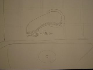
Faucet Sketch
This last entry is an actual sketch. I didnt get an opputunity to photo it but it was so horrible I needed to include it. This was the bath tub/shower at a friends. Now when you went to take a shower you could turn the water on with the hot and cold knobs but it would go through the faucet. I tried looking for another button or knob something that would make the water flow through the faucet but there was nothing. So I tried to pull the hot water knob then the cold water knob but still nothing. Finally I broke down and asked my friend. What it turns out you had to do was pull the lip of the faucet down. This is what turned the shower on.

Fan
This is the control knob for my fan. It is a knob that affordes turning but the layout if a little off. Why have the power go from zero to three. It seems mor natural to have the power settings go from one to three.

Stereo 2
This is the front of my stereo. I'm unsure if you can see it well in this picture but the Volume/Balance knob on the right is actually one knob that is two. The bottom portion of the knob controls volume and the top part of the knob controls the balance. By mapping multiple functions to the same knob you lack good design. The suttle difference in height and knobs also makes it bad.

RCA on VCR
I always loved this design on VCR's and TV's. They put the RCA cables right in the front so you can quickly and easily hook something up and run it through this device. The ease of use is the best property of this design.

Stereo Back
The problem I had with back of this stereo that the labels on the back are not really visible. In order to photograph them well enough I needed to take the picture at an angle and with the flash on. So the poor design with this is the lack of readability.

Open
This polaroid camera is an example of good design in that it folds open and closed. This helps by being space efficient and also protects the lens and flash. The controls are simple point and shoot so nothing confuses you either.

Closed

Cruise Control
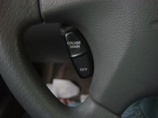
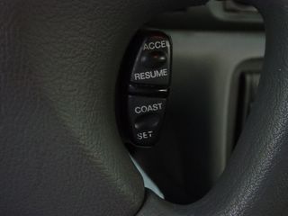
One good design about my car is the cruise controls buttons. All of the buttons are right on the steering wheel. So you don't have to go fidgeting around your car while trying to set your speed. The mapping is nice since the buttons are right at your finger tips.

Left Contols
Look

Right Controls
Look

Stereo Button
This is a stereo button called Auto-M in my car. I have no idea what it does. I hit it before and the lack of feedback doesn't seem like it does anything. The mapping of the button to the stereo makes me think it has something to do with the stereo but it could have anythign to do with the CD player or the radio.

Mint Tin
This was a mint tin I recently got. I had never encountered the tin before so when I wanted a mint I went to pull the top off. That did not work. So I tried hard and it still didnt come off. Finaly a friend showed me how to get at the mints that I so wanted. You needed to puch down on the top of the tin on the button looking part. When that's pressed the hinges on the side release and you can take the top off. It was an interesting design but some instructions or maybe the classic design of just pulling the top off the body would have helped.

Heat In My House
So my house has an interesting heat issue. First it has these radiators.

You actually have to turn the knob on the radiator to the left first to turn turn on the heat in each room. The bad design comes with the use of multiple systems for one function and no labels or no natural model that works.

Then it has this thermometer. So you would think that the thermostat would control the heat. Turn it on on the thermostat it's on. Turn it up the heat goes up. Sadly that's not how it works.

Then we see. The doors give you instant access to the back of the podium where all the electronics are. These doors also give you access to the floor something that isn't granted by the front. So while at first a weird design it pans out in the end.

At first this looks like a bad design. Why put doors on the front of a podium?

Razr Phone
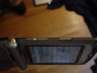
I have to say that these buttons on the Razr phone when you first get it are a mystery. They're not labeled so you just have to press them and figure them out. The button on the bottom is levered and controls the volume. Up goes up down down. Pressing the top button does nothing. However if you hold the top button the phone goes into speaker mode. Nothing leads the user to this conclusion.

Battery
Look

Dell Laptop Battery
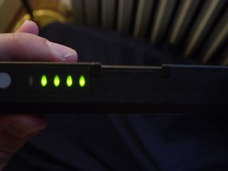
I found the design to the Dell Laptop Battery very handy. If you have more then one battery as I do and need to figure out how much juice it has left all you need to do is hit the button on the battery and the lights on the battery offer feedback on how much charge the battery has left.

Ceiling Fan
On this ceiling fan in my room I always get confused. Which chain turns the fan on and which turns on the light. There is no way to tell. Maybe if there was a label on the chains or somethin g along those lines to make the chains differentiable.

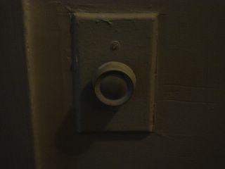
Another button/dial. The mapping in my mind was to turn the dial to turn on the light. Again it was a button that turned on the light and the knob controlled the light level. Why not just make turning the knob make the light turn on and off.

The Counter
I labeled this as good design. It is a counter and a cutting board all in one. This eliminates the need for a seperate cutting board and makes things more convienient.

This one is crazy. It's a light switch but it has a dial and a slider which is labeled on and off. So the mapping in my mind was to slide the slider to on and control the light level with the knob. This didn't work. In fact the way you turn on the light is by pressing the knob. To make this better just make the slider act as the on and off switch.

Is this a chair for people or art or both. It had a ledge which affordes sitting but it hard edges make it look more like art then a chair.

Main Desk
Look

I work down in ETC Production services. ETC also has a main desk where students go to take out videos for classes. This is the sign for my department which is right infront of the stairs to the library. So students gets our department mixed up with the main desk all the time. Mostly because we are right next to the stairs and all they see is the ETC sign. Maybe the signs should be changed to something different instead of highlighting ETC maybe highlight Production services.

What does this sign mean? It says no standing from here to corner yet if I stand there nothing happens. However if I park my car where I'm not supposed to stand I get a ticket. Maybe it should read "No Parking Here To Corner."